Prosper Canada is a charity dedicated to expanding economic opportunity for Canadians living in poverty through program and policy innovation. Dealing with Debt is a booklet that provides activities to help you manage your debt, identify your money priorities, calculate what you owe and strategize how you can pay it back.
Context Creative was tasked with creating a workbook that would inform, enable and inspire with fun illustrated scenarios. I used Canadian animals to illustrate concepts like money priorities, tracking expenses and knowing your rights. The illustrations used abstracted geometric shapes to create stylised characters and the Prosper colour palette helps connect the family of illustrations.
Unfolding the Map is an exhibition and public programme that examines the changing face of cartography in New Zealand and the Pacific. Fortyfive Design’s role was to design the exhibition and manage the branding, production and installation. This required working closely with the curator and programmes team to ensure the exhibition functioned successfully in engaging with a very broad public audience.
My involvement in this project was in the brand development. I was also largely responsible for the exhibition layout, planning, production and installation.
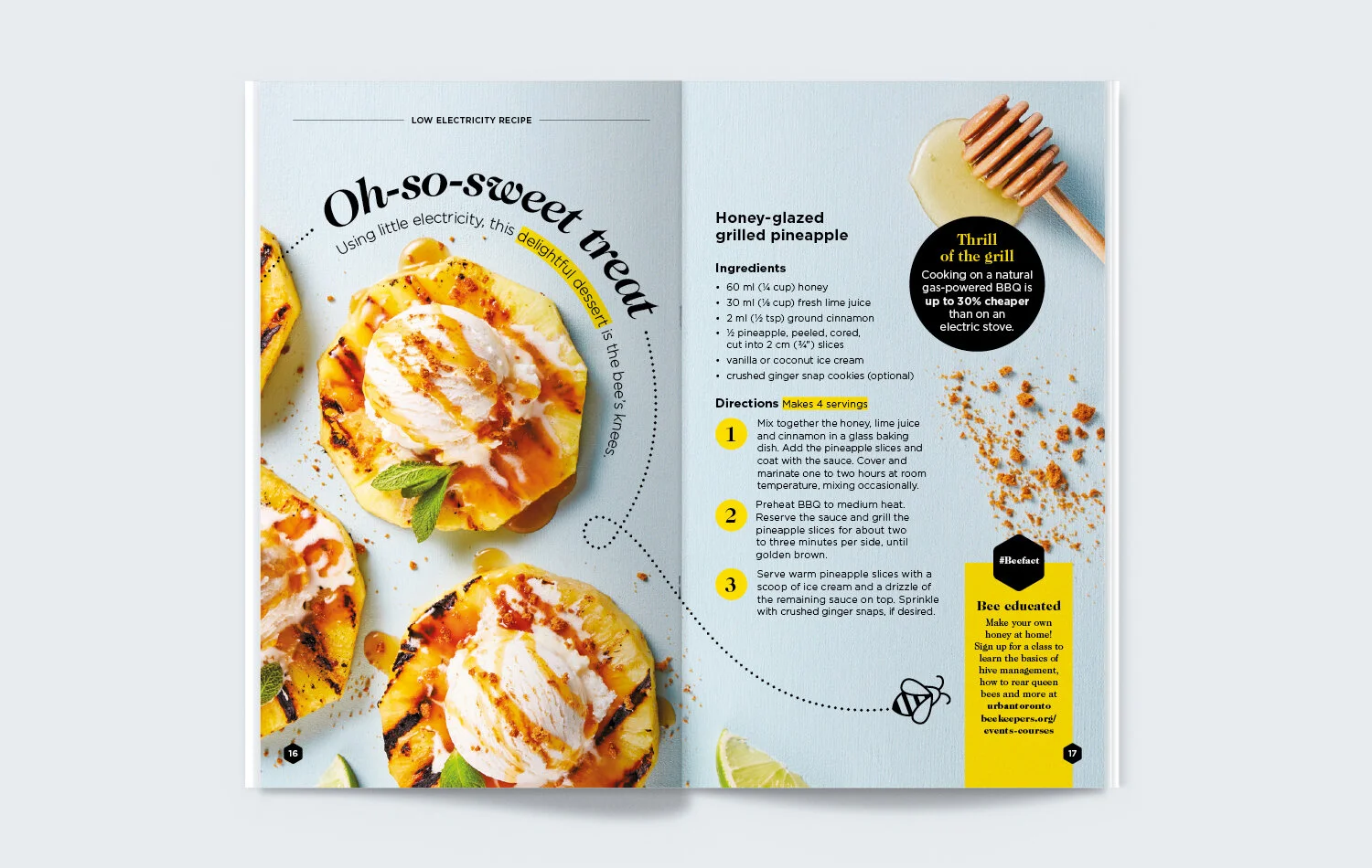
These 24-page, seasonal booklets were designed to promote programs, services and energy-saving tips in a fresh, original way. Distributed to all households in the Toronto city area, this editorial approach was a cost-effective way to increase engagement and allowed for more lifestyle content.
I designed the Spring and Fall 2018 booklets with two distinctly different themes, bees and colourful, illustrated Fall (Autumn). This project gave me the opportunity to showcase a more editorial side to my design work. Most of the illustrated elements were drawn by myself with the help of a more advanced illustrator for the ‘Happy Campers” spread. I art directed photoshoots for the craft and recipe pages, as well as some illustrated spreads.
These booklets were awarded international Summit Creative and Summit Marketing Effectiveness Awards in 2018 and 2019.
Fortyfive Design were asked to design wayfinding and signage for The Royal Society of New Zealand's newly renovated building. I focused on using varying scale and contrasting materials in a monochrome palette. The result was a system that reflected the industrial nature of the building while staying true to the classic Royal Society brand.
Every year The Salvation Army hold their Self Denial Appeal. It is an internal appeal that calls upon Salvationists around the world to give a portion of their salary over a certain time period in order to help people in need in more than 100 countries. The theme this year was 'love changes lives'.
The branding and theme changes each year. The New Zealand and Australian armies usually share the same design. However, this year we wanted to 'kiwi-ise' the design and simplify what Australia had provided. Using the same typeface, main logo, photography and colour palette I was able to create a strong, clean and simple identity with the theme and main message most dominant across the material.
We also wanted to place more of a prominence on educating children this appeal. An entirely new and distinctive Self Denial Appeal logo was designed for all children and family-facing collateral. This branding needed to sit well next to the existing logo but have a more fun and playful feel. The result used a colour palette that was slightly altered from the original and brought in illustrations to compliment the photography and activities.
The Salvation Army provided opportunities for some one-off projects that had a lot of creative freedom. Shown here are a few different examples including, Think Small – Foundations of Children’s Work, the 2019 Christmas Party poster and Booth College Commissioning & Graduation. The former, more recent work is discussed below.
Think Small – Foundations of Children’s Work
This programme artwork was designed to be bold and modern. The gridded, geometric illustration style was chosen to replicate the idea of children’s building blocks. Each of the elements included are touching on important stories from the Bible.
THQ Goes Wild
The 2019 Christmas party was held at the Wellington Zoo, therefore a non-traditional festive approach was taken.
As part of the Leading Edge exhibition at the National Library of New Zealand, I created a digital resource to expand on the information presented on the walls. The result was a digital ‘book’ that allows viewers to read further information, zoom into images, listen to sound archives and watch video content – all designed and produced for the gallery iPads on Adobe Digital Publishing Suite.
This assortment of card designs are a fun collection created for the Fortyfive Design Store and the Salvation Army of New Zealand, Fiji and Tonga's Christmas 2016.
I was given creative freedom from both of these clients, which gave me the chance to try new things, develop my hand-lettering and basic illustration skills and try different print finishing.
The Fortyfive Design Store cards are sold in a range of design and gift shops around New Zealand.
This is a selection of my most recent logo designs. The logos are as varied as the brands. Each has its own personality reflective of the character and goals of the organisation or event represented.
Children's Ministries
The Salvation Army of New Zealand was after a new brand for the Children's Ministries Department. The one request was that the logo be bright and colourful and include the Salvation Army shield. The logotype created stems from the idea of building blocks, geometric shapes and puzzle pieces. The result is a logo that is very contemporary and playful.
NL 50
This mark needed to sit comfortably with the National Library of New Zealand's primary brand but in a more playful and celebratory way for it's 50th birthday. The overall result was a simple lockup and secondary brand that was easy to apply to different formats and colour ways.
2017 Sole Officer Symposium
The 2017 Sole Officer Symposium is a conference for single officers in the Salvation Army from New Zealand, Australia, Fiji & Tonga. They were after a mark that would represent the theme for this years conference 'Whole in One'. A quotation mark was used to represent the idea of each person having a voice. The way the mark is used in this context allows it to also represent a speech bubble.
GM Accounting
Wellington accounting company GM Accounting needed a brand refresh. The fresh brand that needed to be easy to use and work well alongside the Chartered Accountants brand. The spot motif is alluding to the idea of counting and bar charts.
Love Changes Lives
This brand was developed to work alongside the existing Self Denial Appeal 2017 logo (designed by the Salvation Army in Australia). It is for all the children appeal material. The need was for this brand to be more fun, friendly and have a youthful feel. The illustrations were then taken and used throughout much of the material.
AWIS
The Association for Women in Science (AWIS) 2014 conference in Wellington gave a brief to develop a brand that had more energy and had a fresh, contemporary feel from previous years. Using bold colours, hexagonal shapes and dynamic angles we were able to give a subtle nod to science without the serious tone.
Philanthropy Summit 2017
This was a refresh on an existing logo that was updated to work alongside Philanthropy New Zealand's new primary brand.
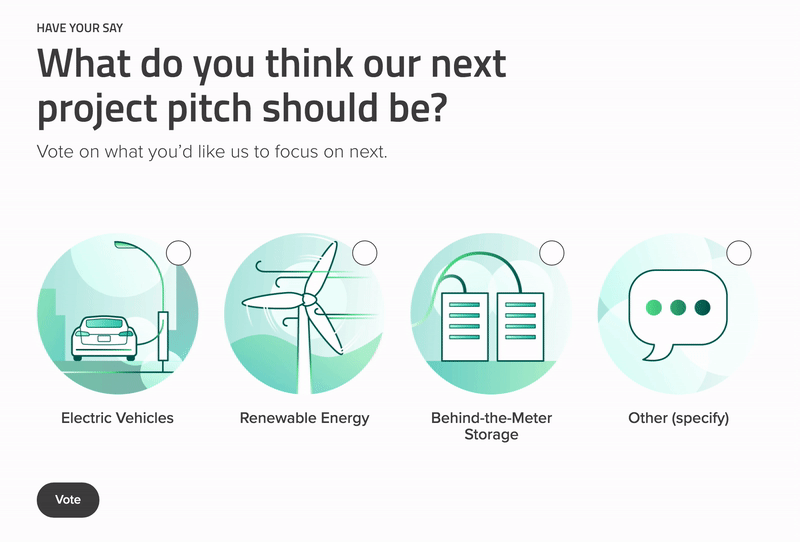
In 2019, Context Creative developed a microsite to allow vendors to pitch innovative ideas and solutions for the city of Toronto to Toronto Hydro. These ideas could potentially be implemented by the utility. This was a collaborative team project, I was one of two designers helping with wire-framing and visuals of the website.
Custom illustrations were created and we included touches of animation to give the pages more life. Objects pop or slide in to create a dynamism to the page without becoming tired. Fresh colours that touch on the Toronto Hydro brand colours were used in a unique and interesting way. To visit the live site click here.
Evergreen is a not-for-profit working to restore the connection between Canada’s cities and the natural environment. We were asked to create a website for their Community Solutions Portal that would make smart city solutions approachable for all kinds of municipalities. As a team under a tight deadline, we had to collaborate efficiently and quickly.
I was one of two designers involved in wire-framing and design. We landed on a clean, spacious style that felt approachable. As the concept of “smart cities” and “smart technology” was overwhelming for many users, we tried to make the design as simple and gentle as possible to ease that feeling. Incorporating soft, rounded edges and very little colour blocking, we presented to the user a soft, friendly, simple, but also a very legitimate and professional personality. Visit the live website here.
War Cry is a fortnightly 24-page Christian magazine for Salvation Army readers and all others wanting to explore faith issues. It reaches a wide audience of different age groups around New Zealand, Fiji, Tonga and Samoa and has been running for more that 130 years.
My role as Senior Graphic Designer was to help plan, design and edit allocated spreads every issue, marrying text and ideas with visual design to maximise the impact of the content. I worked along side an editor, art director and writers, and liaised with printers to meet tight deadlines and deal with any publication issues that arose.
These examples shown are just some of my design highlights for the magazine.
Here is a link to the full catalogue of War Cry published online. I designed for issues between October 2016 to May 2017 and November 2019.